Octerra has many features and functions, but our main goal is to streamline workflow and help users organize their work. In this article, we will briefly cover 3 of the navigation tools that you will encounter.
The Navigation Sidebar
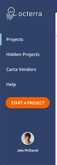
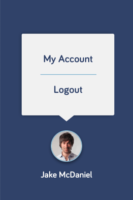
The navigation lives in the left-hand sidebar. Here, you'll see links to various pages on Octerra, as well as your user avatar, that when clicked, displays links to "My Account" and "Logout".

Based on your company settings and user permissions, this list may slightly change. This screenshot includes the most standard options.
Clicking "Projects" on any page in Octerra will redirect you to the Project List page.
The User Menu
The user menu is an easy way to access your account settings or log out.

The Project List Page
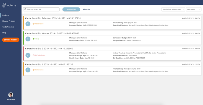
The Project List Page is the central location where you can find all of your projects. When you first log in, there may not be much are any content at all. Don't worry, this page will start filling up with information soon!

Each of the boxes on this page is referred to as a project card. They provide some basic information about a project to give a high-level view of what is happening. As this list grows, we can use sort and filter tools provided on the page to help manage our project list.
To access more information and view a project card's corresponding project page, click on the title.
The Project Page
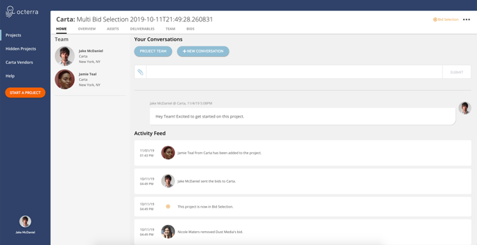
Every project page uses the same basic layout to store information. The title of the project will be listed at the top, a production stage will be displayed below, a list of tabs are available to view different sections of information (Home, Overview, Team, etc.), and an Actions dropdown menu. Some of this information will change based on your view and role.
Example: A vendor submitting a bid on a given project will see a tab labeled "Vendor Response" where they can submit a bid. A producer requesting the bid will have a different tab labeled "Bids" where they can review responses.

